Financial Planning Tool
Making advisor-led personal investing more accessible to everyday people
Challenge
Use design best practices, stakeholder interviews, and end user research to redesign a complicated financial advisor tool for the everyday investor.
- My Role: Product Designer
- My Team: 1 Product Manager, 2 Designers, 1 Design Manager, 6 Engineers
- Client: Well-known Chicago financial services company
- Business Goal: Modernize client's business offerings with investor tools that can compete in the robo-advisor space
- Duration: 4 Months (my involvement; project is ongoing)
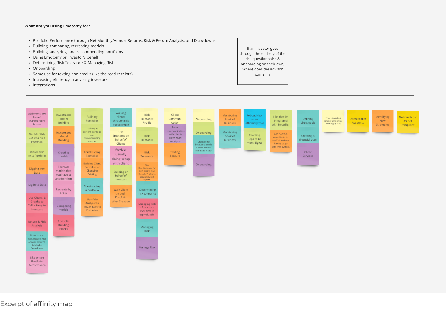
Joining the Project: Combing Existing Research
When I joined the project, I saw an opportunity to clarify where the business wanted the product to go. Prior to my team joining, the client's internal design team had done preliminary research. To begin understanding the business's intentions, as well as the needs of the end users, I listened to 11 hours of recorded interviews. From that, I turned my notes into an affinity map, extracted conclusions, and presented this information both to my team and the client. The research had not previously been synthesized.
Remote Workshop
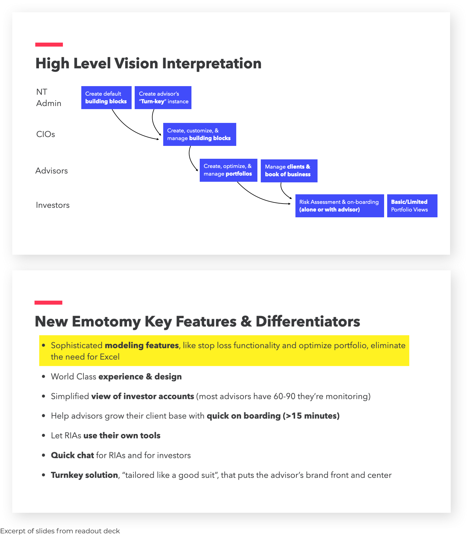
Up until this point, the client was very focused on "quick wins" and less so on what we were ultimately trying to build. The research allowed the team to begin discussing long term product vision with the client. We eventually invited the client to a vision setting workshop, where we gathered requirements for the long term. Setting the stage with the initial research and asking the right questions allowed us to reach this stage.
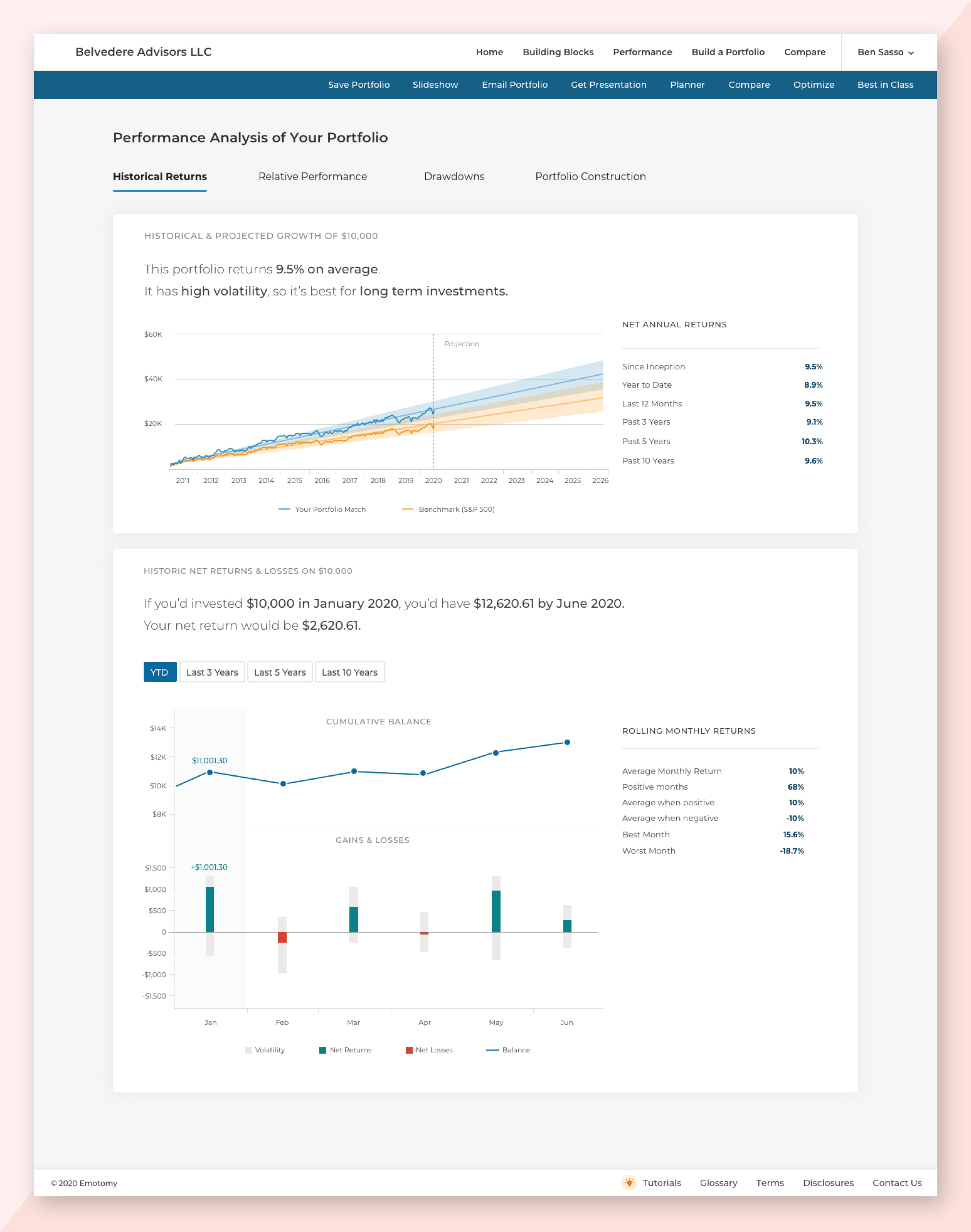
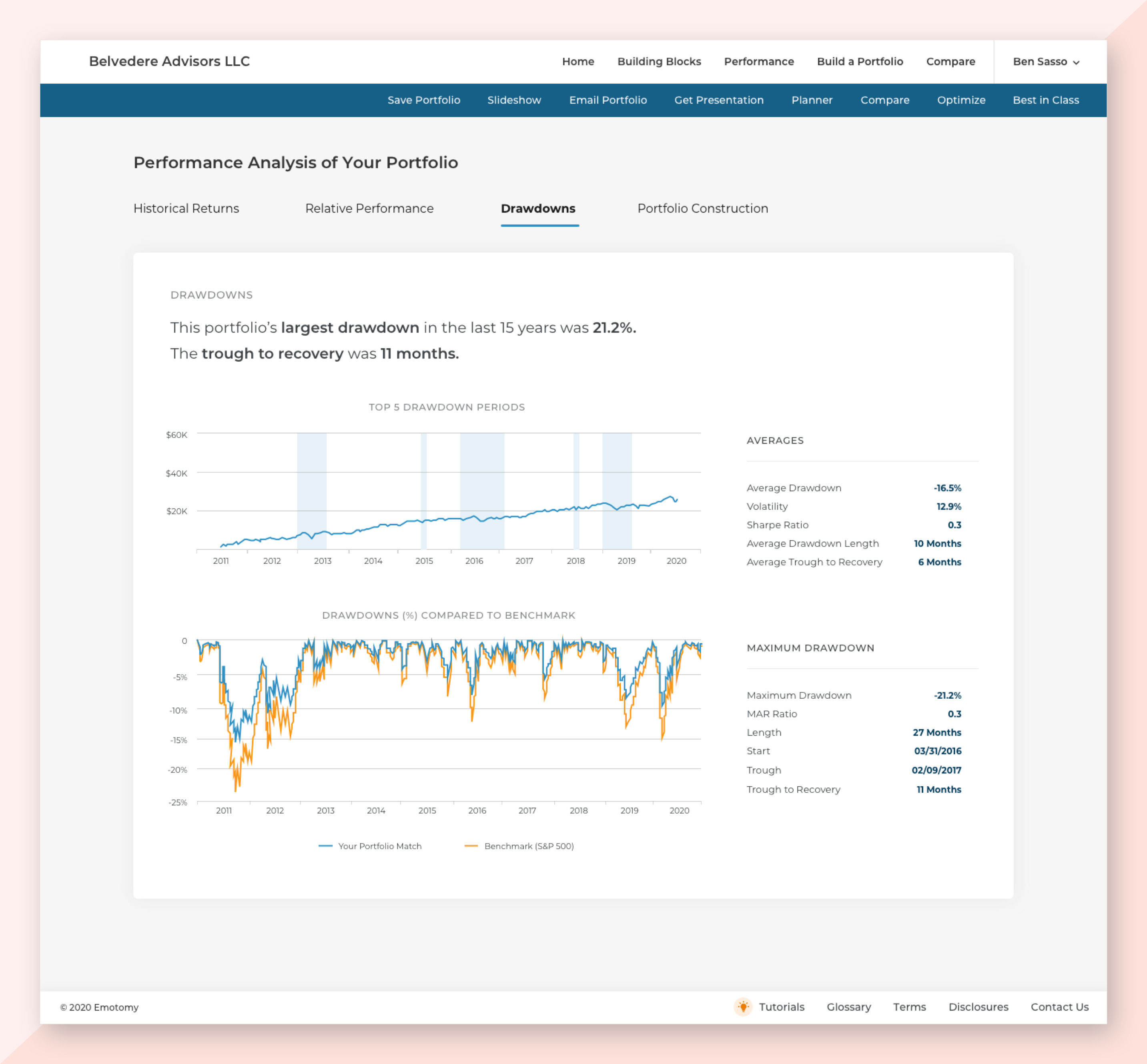
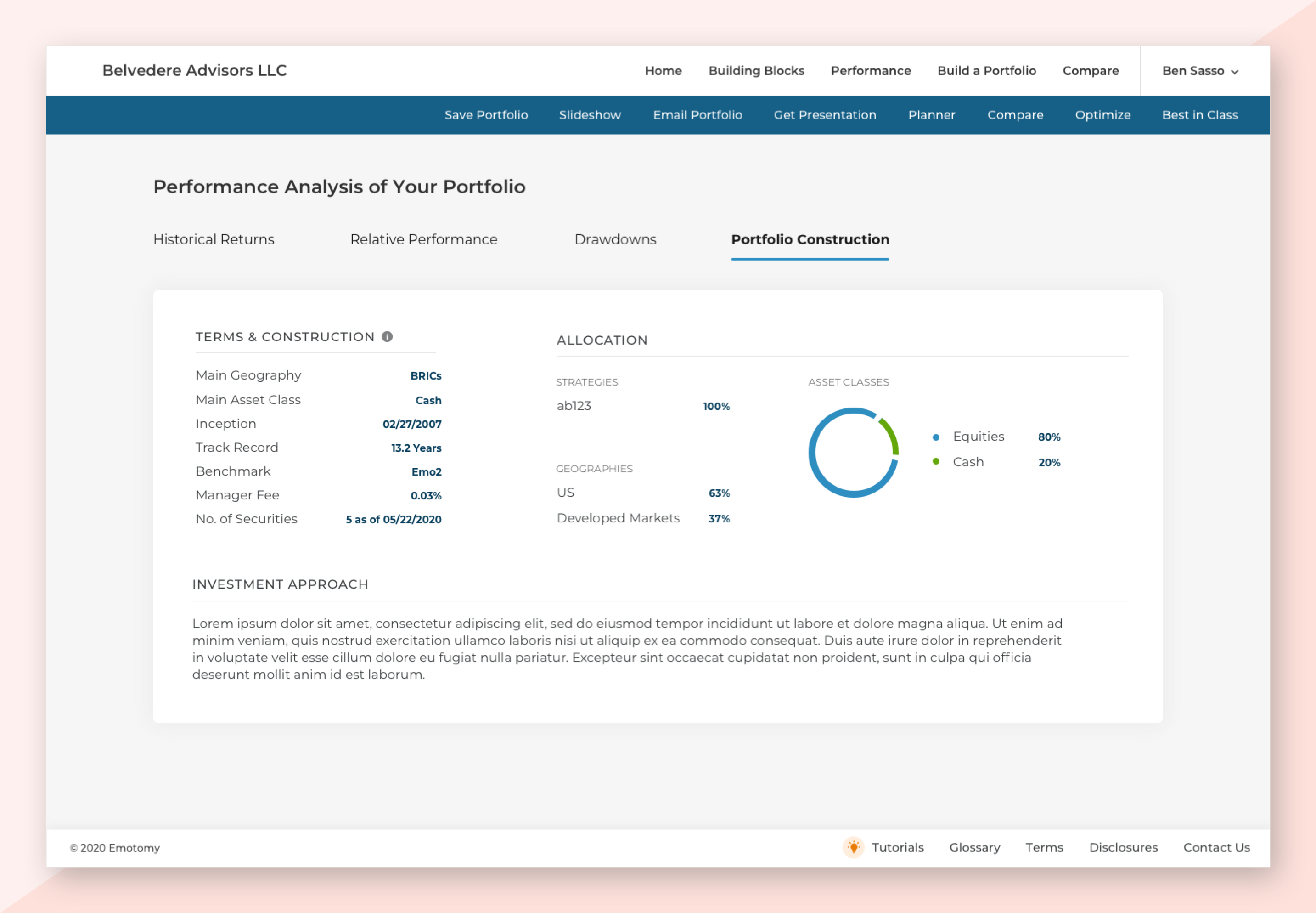
Performance Analysis
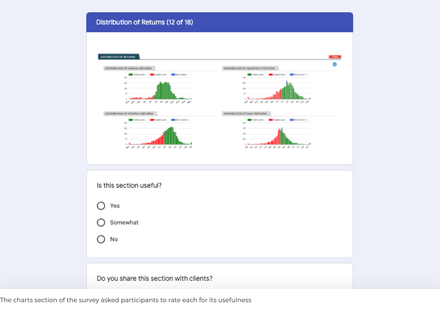
A feature I owned during my tenure with the project was Performance Analysis. The task was to redesign a page full of investment performance charts to be friendly and understandable enough for investors. The original page had 18 charts, which I condensed down to six.
Research
The current platform had a very small user base. The team decided on a survey, hoping to get feedback from all users. In the end, we received feedback from more than half.
The survey had two main objectives: To understand what stories advisors were telling to their investors using Performance Analysis, and which charts they found most useful in this story telling. There was a multiple choice section to glean high level understanding, a section rating the usefulness of each of the 18 existing charts.
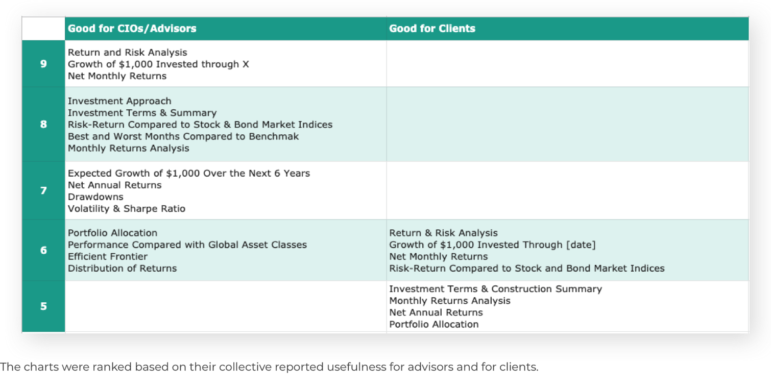
To interpret the results for the charts rankings in particular, I assigned a point system. A "yes" was 2 points, "maybe" 1 point, and "no" 0 points. I then added up the totals for each chart for both advisor usefulness and investor usefulness. From there, the results were clear. No charts were especially useful for investors, and the ones that were were centered around returns.
UI
The original UI was information overload with 18 charts. Leveraging what I'd learned in my research, I took the key information from the existing UI and consolidated it into my new mocks. My goal was to make the new charts extremely easy to understand. To aid advisors in explaining the charts to investors in real time, I wrote copy that the advisor could literally read off of to explain the chart to clients.