Inventory Application & Mobile Scanner
Redesign of mobile scanner application for warehouse workers
and of customer facing inventory management system
Challenge
Create a modern and improved experience for two different applications, with limited to no ability to adjust backend logic/client APIs
- My Role: Lead Designer
- My Team: 1 Product Manager, 10 Engineers
- Client: Warehousing & Logistics Company
- Business Goal: Get a replacement mobile scanner application built ASAP; Attract new customers to the business with a modernized inventory management app
- Duration:~8 Months total for both projects
Part 1: Android Mobile Scanner
Project Kick-off: Contextual Research
Persona: Warehouse Workers
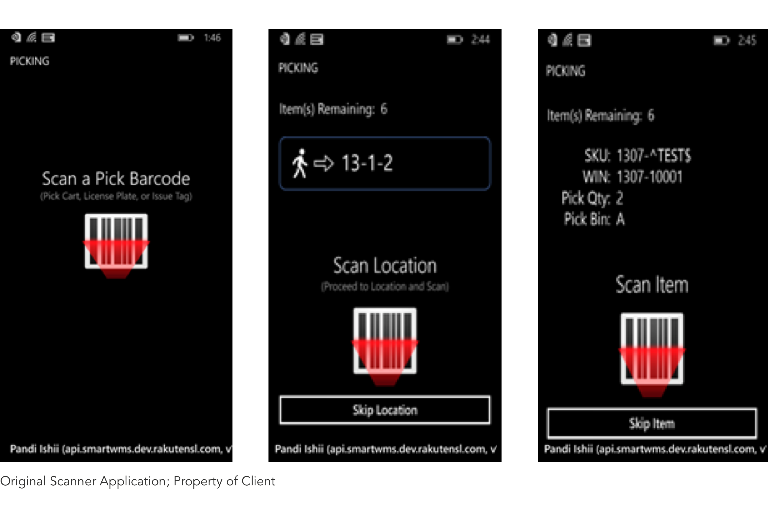
In the first phase of the engagement, we were tasked with redesigning the client's warehouse mobile scanner application. The android device used in the warehouse was being discontinued, and the client needed to upgrade all their devices and create a new application that would be compatible.
As a first step to understanding the problem space, the team visited one of the client’s warehouses to understand the big picture of worker’s tasks and how they completed them.
Areas of Opportunity
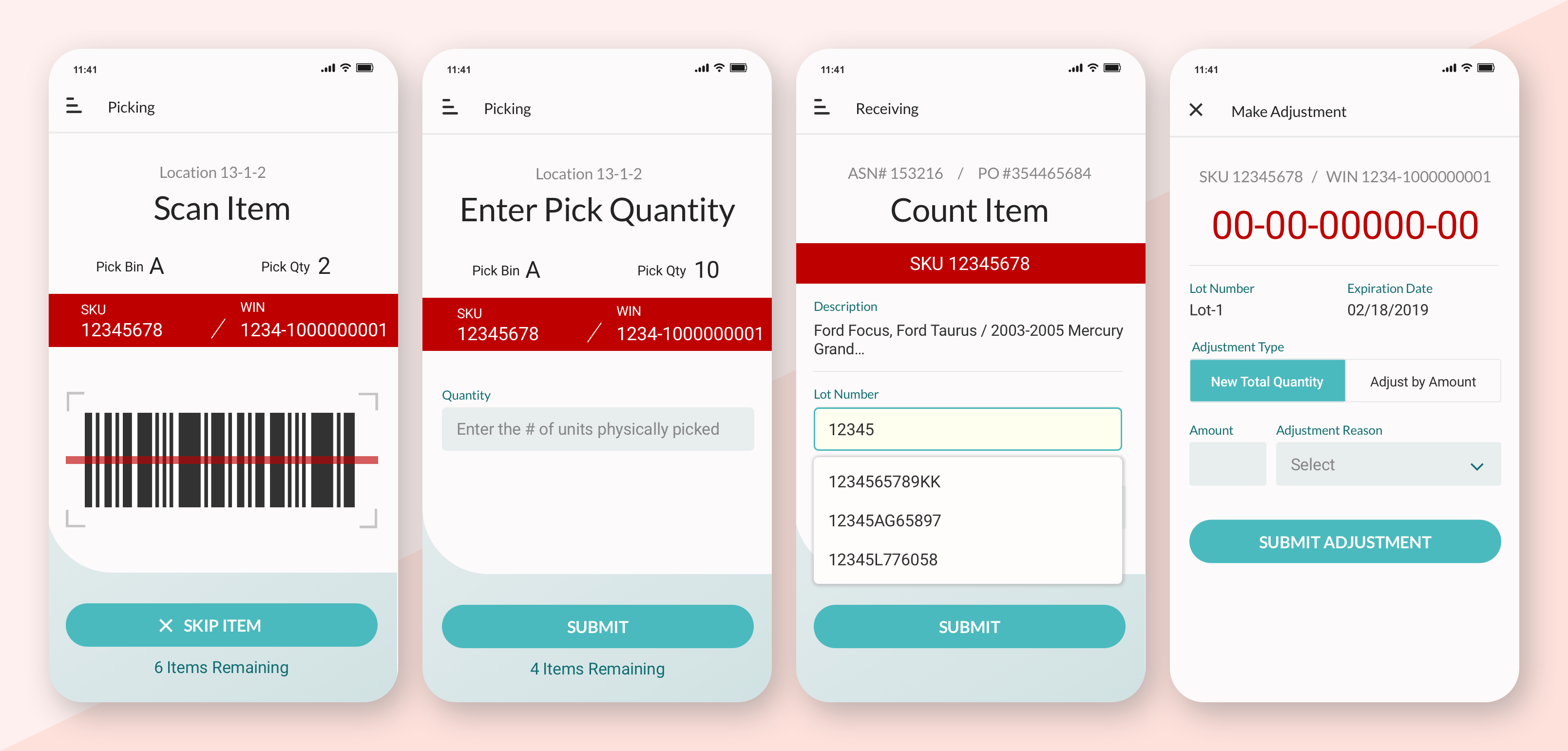
- Cleaner, modern, easier to read screens
- Eliminate cumbersome workflows (i.e. one task spread across multiple screens when could easily be one)
- Improve device ergonomics (research validated that upgraded device had improved ergonomics)
- Additional recommendations for improved ergonomics through wearables, such as wristbands and/or keychains for more easily carrying the device
UI Design
Time was the biggest constraint on redesigning the UI. The client needed to ship the new application as soon as possible, since they'd be opening a new warehouse in 2 months and needed to make sure the application was ready for all the new devices.
MVP Beta Testing
We returned to the client’s warehouse to allow a few warehouse workers to take the new device and application on a test drive while we observed and asked questions.
The results of the beta test were positive, with very few usability issues uncovered in the redesign. The more difficult aspects of interaction stemmed from business logic we were unable to change for MVP, due to constraints in the client’s API. Regardless, we were able to make a handful of observations for the client to consider in the future, such as:
- Unclear if dimensions referred to individual items or the entire box, leading to the application creating warehouse runs that did not have enough space on the cart
- Limitations around barcodes, leading workers to sometimes have to go online from their own mobile device and create a barcode to scan in order to move to the next step in the process
- Other generalized workflow optimizations, which we could easily chart out and make recommendations on, given the opportunity (again, this was out of scope)
Part 2: Customer Facing Inventory Management System
Project Kick-off: Client Workshop
Persona: Small to medium business owners (external customers)
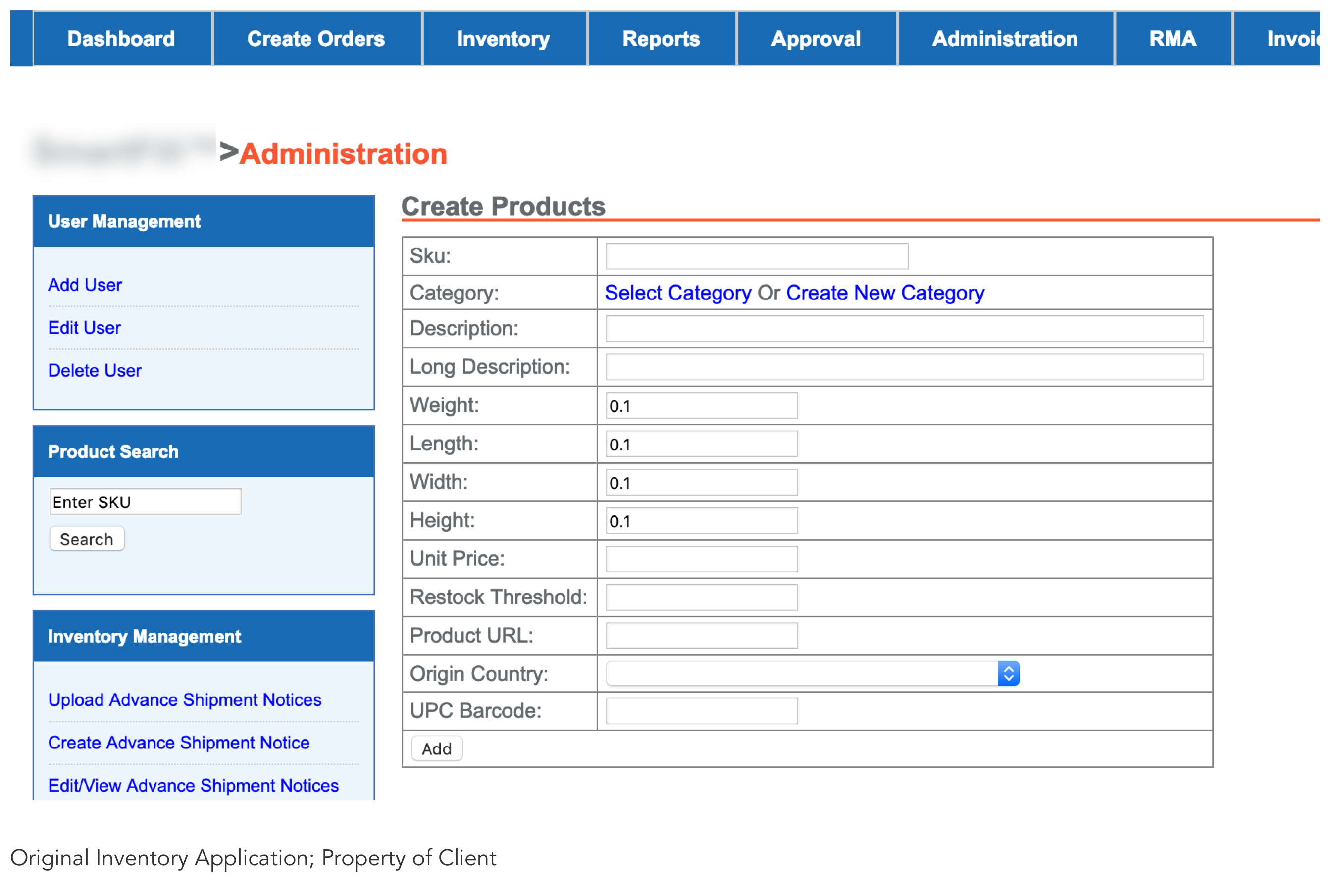
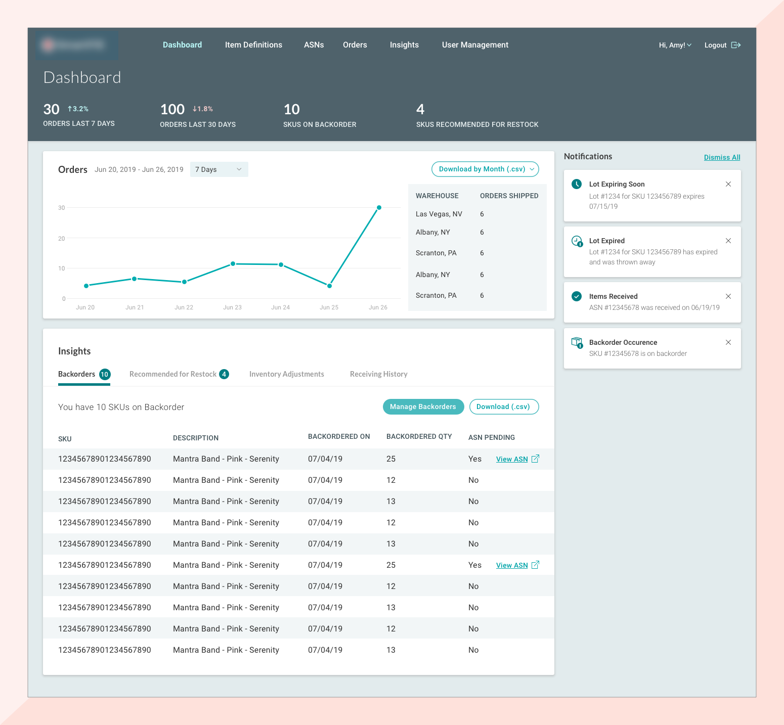
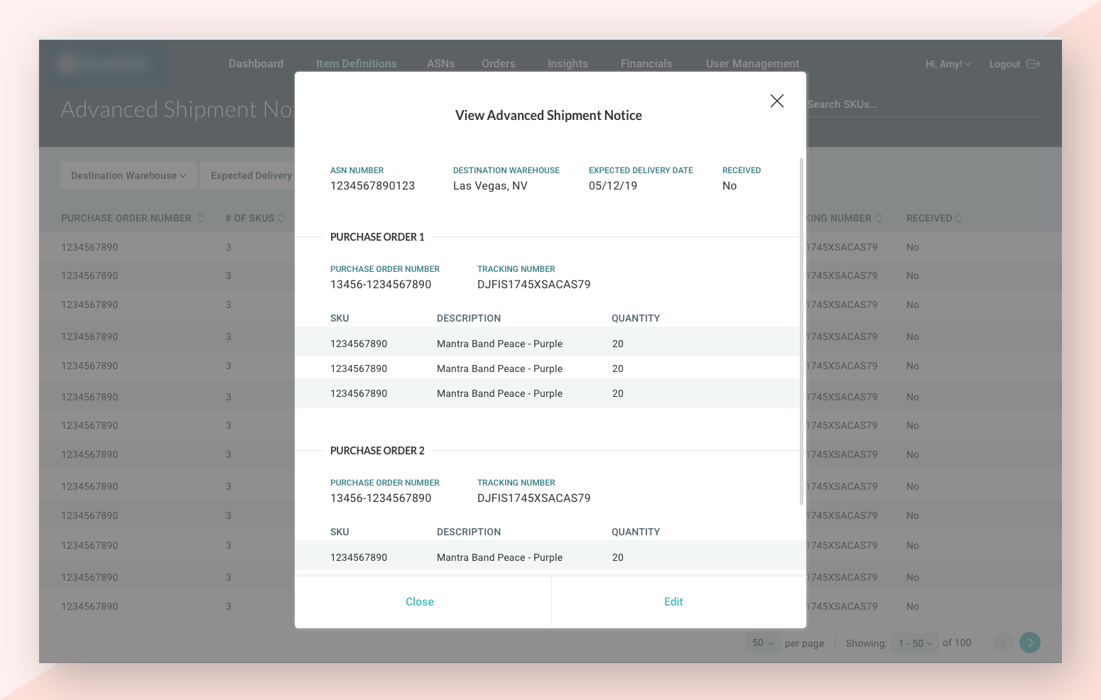
The client was impressed with our first project and decided to work with us on another. We were tasked with redesigning their inventory management system, which gives customers insights into their own products being stored at the warehouse.
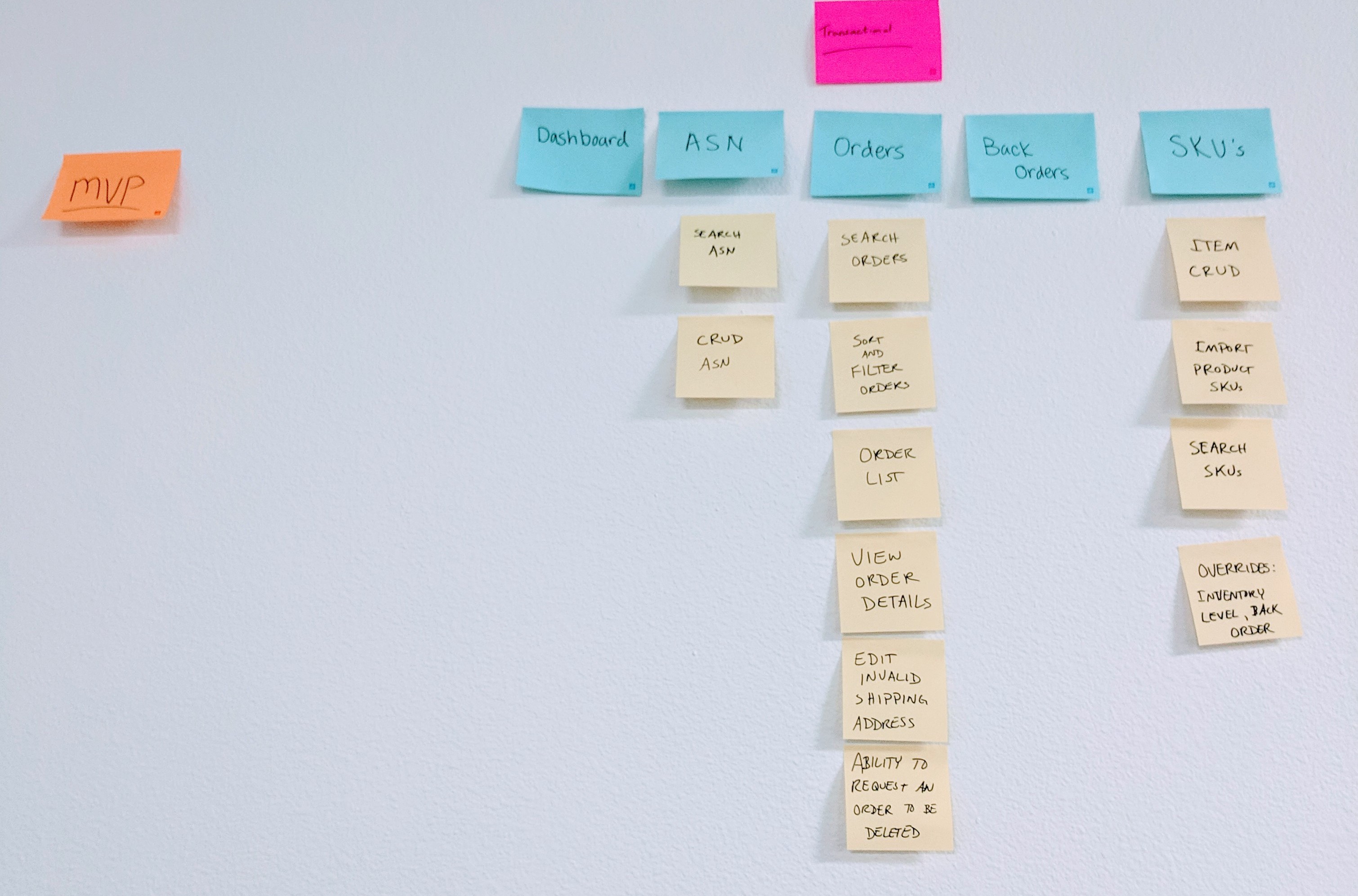
We began the project by way of workshop, our typical approach to building new software. Through this process, we were able to get a sense of the scope and what functional and non-functional requirements were important to the client. Among the requirements gathered, a modernized UI was a necessity.
Project Restraints
Limited User Research
We asked the client if we could interview end-customers, but they were reluctant. It became apparent that there was distrust of the accuracy of customer feedback. Although we insisted we would be able to extract the useful information regardless, the client was only comfortable with us talking to customer service.
Talking to customer service allowed some context into end users' pain points; mainly, the current application was so cumbersome that customer service reps essentially did all the legwork on behalf of customers, who could not figure out the application. Unfortunately, without access to end users, we were not able to get deep details on exactly where those pain points were. But with our own access to the current application and with an improved redesign feeling like low hanging fruit, we were confident we could create something much better and submit the MVP as our best hypothesis, with the caveat to the client that testing would need to be done on the product before a full roll-out.
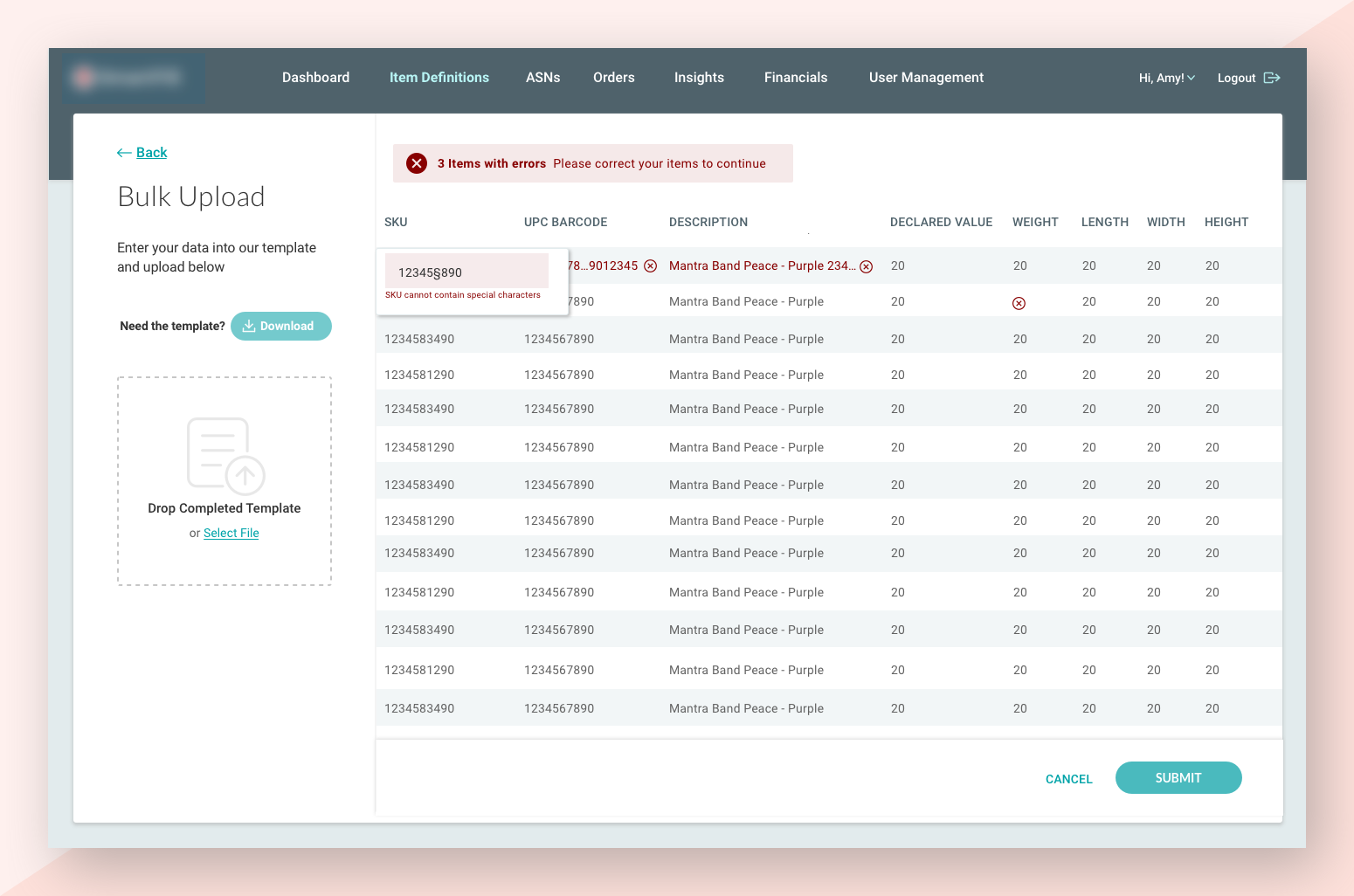
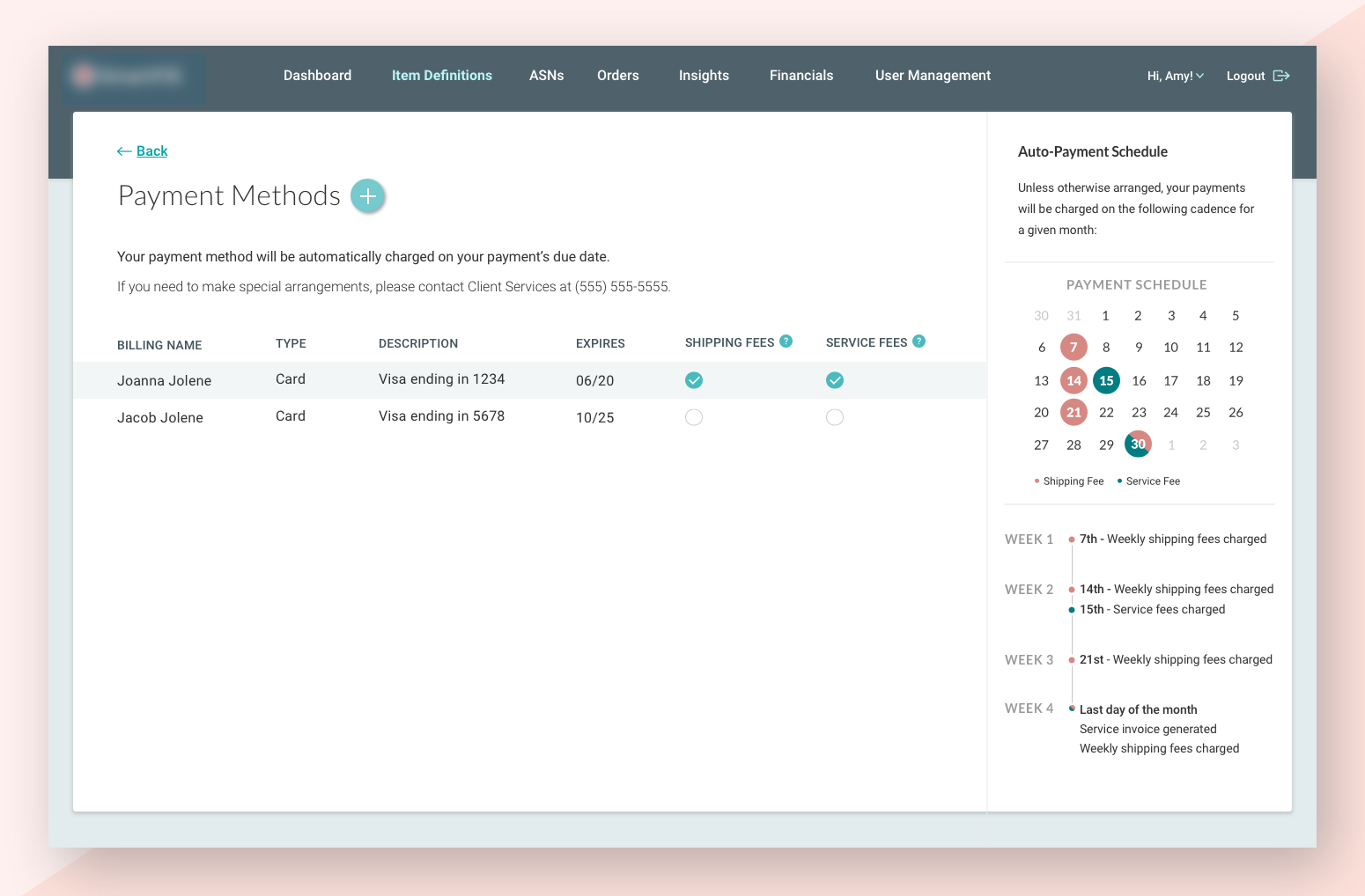
Limited Ability to Improve Cumbersome Workflows
While reorganizing and designing the UI certainly lead to many experience improvements, some of the biggest UX problems were unable to be addressed due to the client’s API. In particular, a confusing automated payment flow was not able to be changed before MVP. Once this became clear, we decided to instead make the rules of the payment processing as transparent as possible. This way, even if the business logic was confusing, the users could at least understand what was happening.
UI Design
To maintain visual consistency, the same palette and fonts were used here as on the mobile scanner, without being exactly the same. The client wanted the application to have a strong visual impact, while of course still being in line with their brand colors.
Results
- 2 MVPs successfully delivered in short timeframes (average of 3 months)
- Updated UI that the client can use as a starting point for other projects
- Client now actively working on fixing business logic that create a confusing user experience, in part due to our influence.